
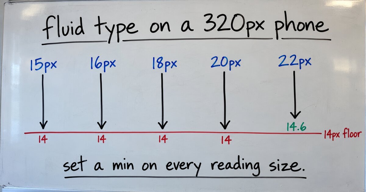
On a 320px phone, my block theme’s paragraphs and its h3, h4, h5 and h6 headings all rendered at exactly 14px. Nothing in the theme said 14px. The paragraphs were set to an 18px preset, and the headings to presets from 14px to 20px. WordPress’s fluid typography had picked the phone sizes, and it picked the same one for all of them.
Where the phone size comes from
With settings.typography.fluid set to true in theme.json, WordPress turns each font size preset into a CSS clamp() that runs from a small size on phones to the preset’s full size on wide screens. A preset can give the small size itself with a fluid object that has min and max. When it doesn’t, core works the small size out, as the function that builds the clamp shows in WordPress 7.1.3:
- It multiplies the size by
1 - 0.075 x log2(size in px). For 16px that factor is 0.7, and for 20px it is about 0.68. - If the result is 14px or less, it uses 14px instead. That 14px is the floor.
- The small size applies at a 320px viewport, and the clamp grows to the full size at the theme’s
layout.wideSize.
A preset of 14px or less isn’t made fluid at all; it stays fixed.
The floor is meant to stop text getting unreadably small, and for that job it works. But the factor shrinks every reading size below 14px before the floor catches it. I ran core’s function on the sizes a typical theme uses:
| Preset | Phone size (320px) |
|---|---|
| 15px | 14px |
| 16px | 14px |
| 18px | 14px |
| 20px | 14px |
| 22px | 14.6px |
| 24px | 15.7px |
Everything from 15px to about 20.8px lands on the floor. Body text and the headings meant to sit above it become one size.
The Theme Handbook’s typography page does say that 14px is “the default minimum font-size limit.” It doesn’t show the formula that sends most reading sizes straight to it. And this is what people see: a request on WordPress Trac to switch fluid font sizes off says “the fonts often end up looking way too small on mobile.”
Raising the floor moves the problem
The global fluid setting also accepts an object, and its minFontSize key changes the 14px floor, as the WordPress 6.2 dev note explains. It doesn’t fix this.
With "fluid": { "minFontSize": "16px" }, I ran the same function again. The 18px, 20px, 22px and 24px presets all came out at 16px on a phone. The body text got bigger, and the headings still collapsed onto it.
The fix the default themes use
WordPress’s own recent default themes never let core guess. In Twenty Twenty-Five, every preset either sets its own range or opts out:
{ "slug": "small", "size": "0.875rem", "fluid": false },
{ "slug": "medium", "size": "1rem", "fluid": { "min": "1rem", "max": "1.125rem" } },
{ "slug": "large", "size": "1.38rem", "fluid": { "min": "1.125rem", "max": "1.375rem" } }
Twenty Twenty-Three and Twenty Twenty-Four do the same, as their theme.json files in WordPress 7.1.3 show. An explicit min skips the formula and the floor completely.
For my Blockwright theme, I split the presets into two groups. The small UI sizes, 12px to 16px, are now fluid: false, because a 15px label has no reason to shrink. The four reading sizes each get a min of eight-ninths of their max, so they all shrink by the same factor and keep their order:
{ "slug": "base", "size": "1.125rem", "fluid": { "min": "1rem", "max": "1.125rem" } },
{ "slug": "l", "size": "1.25rem", "fluid": { "min": "1.1111rem", "max": "1.25rem" } },
{ "slug": "lead", "size": "1.375rem", "fluid": { "min": "1.2222rem", "max": "1.375rem" } },
{ "slug": "xl", "size": "1.5rem", "fluid": { "min": "1.3333rem", "max": "1.5rem" } }
On a 320px phone, body text is now 16px, h3 is 19.6px and h4 is 17.8px. I also moved h5 and h6 up to the body size, with h6 in uppercase, so no heading renders smaller than the text under it.
If your theme.json has "fluid": true, give every reading-size preset a fluid object with an explicit min and max, and set small UI sizes to "fluid": false. Then load the page at 320px wide and check that body text is at least 16px and every heading is larger than it.