
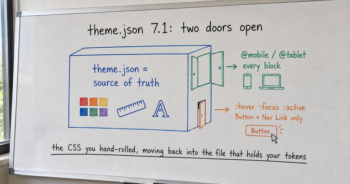
I wanted two ordinary things: a button that darkened when you hovered it, and a hero section whose padding stopped crushing the headline on a phone. Neither is exotic. Both, until this release, were the exact moment I closed theme.json and opened a stylesheet.
That move has a cost, and the cost is not the extra file. It is that the stylesheet and the theme.json stop agreeing. Your colors, spacing, and type live as tokens in one place. Your hover and your breakpoints live as hand-written CSS in another, and the second file has no idea the first exists. Change a token, and the CSS that was supposed to match it quietly drifts.
WordPress 7.1 pulls both of those back into theme.json. Unevenly, but it pulls. I read the 7.1 field guide and its two Global Styles dev notes to get the exact shape, because “you can style hover now” is the kind of half-sentence that hides all the load-bearing details.
The wide door: responsive styles
Any block can now carry per-viewport overrides, keyed by @mobile and @tablet:
"styles": {
  "blocks": {
    "core/group": {
      "spacing": { "padding": { "top": "3rem" } },
      "@mobile": {
        "spacing": { "padding": { "top": "1rem" } }
      }
    }
  }
}
The base style is the desktop style. There is no @desktop key, because desktop is the rules with no viewport wrapped around them. The default thresholds are 480px for mobile and 782px for tablet, and you can move them for the whole theme in settings.viewport, in px, em, or rem. This is the door that swings wide: it applies to every block and to their style variations, not to a special list, and instances store the same @mobile and @tablet keys in their own markup.
The crack: interactive states
The states door opens too, but only part way. You can now write :hover, :focus, :focus-visible, and :active directly under a block:
"styles": {
  "blocks": {
    "core/button": {
      ":hover": {
        "color": { "background": "var:preset|color|contrast" }
      }
    }
  }
}
One limit to catch before you rewrite your whole stylesheet: in 7.1 this works for exactly two blocks, Button and Navigation Link. That is still genuinely useful, because those two are where most theme-authored interaction CSS lived anyway. But a :hover on a Group or an Image stays in your stylesheet for now. There is also an early custom-state hook, -current for the current menu item, defined in theme.json only with no editor UI yet. Custom states take a - prefix; the pseudo-states take a :.
The two features compose, viewport on the outside:
"@mobile": {
  ":hover": {
    "color": { "background": "var:preset|color|contrast" }
  }
}
So a button can darken on hover differently on a phone than on a laptop, and the whole rule stays in the file that already holds your palette.
What I’d move today
Move your Button and Navigation Link hover and focus styles into theme.json, and move your responsive spacing and font-size overrides there too. Leave the rest of your state CSS where it is, because core has not widened that door yet. Do it for the class of styles, not the one button that annoyed you, so the next component inherits the same source of truth instead of a fresh one-off.
I build an adaptive block theme on exactly this premise, one source of truth for every value, so a release that widens what theme.json can hold is one I watch for. It shipped today. The transferable rule is the one I keep relearning: every release, core absorbs a little more of the CSS that themes used to hand-roll, and the single source of truth grows to match. Before you reach for a stylesheet, spend ten minutes checking whether theme.json learned to say the thing this cycle. This same release opened another door I did not expect, the Icons API, which I wrote about here. Two doors in one version. It pays to check which ones are already open before you build another workaround.