
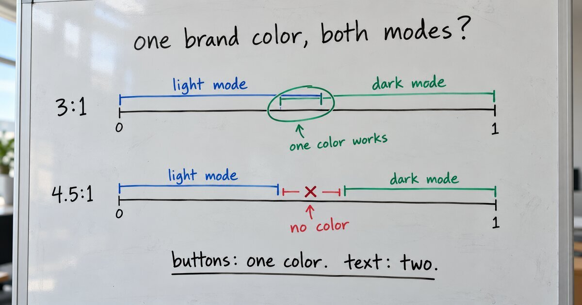
The usual advice for dark mode is to make a second, lighter version of every brand color. Stack Overflow’s team described hand-tuning a separate dark palette, and Ohio State’s web team reports that its scarlet “doesn’t meet accessibility standards on dark backgrounds.”
The color tool in my Blockwright Blocks plugin builds a site’s whole color scheme from one brand color, and the site follows each visitor’s light or dark setting. So I needed to know exactly when one color can serve both modes, and when a second shade is required. The contrast math answers it cleanly, and the answer depends on what the color is used for.
The math
WCAG’s contrast ratio compares the relative luminance of two colors, (L1 + 0.05) / (L2 + 0.05), where L1 is the lighter one, as the WCAG 2.2 definition sets out. Luminance runs from 0 for black to 1 for white. Large text and the parts of a button or control need 3:1, under success criteria 1.4.3 and 1.4.11. Body-sized text needs 4.5:1.
My theme’s light background has a luminance of 0.973 and its dark one 0.0105. Rearrange the formula for each background and a brand color has two luminance limits:
| Ratio | Highest on light | Lowest on dark | One color for both? |
|---|---|---|---|
| 3:1 | 0.291 | 0.131 | yes, anything from 0.131 to 0.291 |
| 4.5:1 | 0.177 | 0.222 | no, the ranges don’t overlap |
At 4.5:1 there is no answer. The best any single color can do against these two backgrounds is 4.11:1 on both. Even against pure white and pure black, the ceiling is about 4.58:1, barely over the line, and any background short of those two extremes lowers it.
So the usual advice is right for body text and often unnecessary for buttons. A link color has to change between modes. A button fill or a large heading often doesn’t.
Where the band sits
Luminance isn’t how designers pick colors, so I mapped the 3:1 band onto OKLCH, a CSS color format whose L runs from 0 (black) to 1 (white) and tracks how light a color looks to people, as MDN’s oklch() page explains.
I stepped L from 0.30 to 0.85 for one hue at a time and tested each color against both backgrounds with the contrast code my tool ships:
| Hue | Passes 3:1 in both modes |
|---|---|
| Gray (no hue) | L 0.51 to 0.66 |
| Red | L 0.53 to 0.675 |
| Orange | L 0.52 to 0.67 |
| Green | L 0.495 to 0.645 |
| Blue | L 0.515 to 0.665 |
| Violet | L 0.525 to 0.675 |
| Pink | L 0.53 to 0.68 |
The band is about 0.15 wide for each hue and moves only a few hundredths from one to the next. Brand colors are usually picked to be vivid and readable on white, which can put them inside it.
Three real colors show both rules at once. The blue #1a73e8 measures 4.39:1 on the light background and 3.85:1 on the dark one: fine as a button in both modes, short of 4.5:1 as text in both. The red #c0392b measures 5.30:1 and 3.19:1, so it works as a button in both modes and as text only in light mode. The orange #ff6a00 measures 2.80:1 and 6.05:1, so it needs a darker shade in light mode even for a button.
What the tool does with it
The tool keeps the brand color exactly as entered for fills and large text, and changes it only in a mode where it fails 3:1, by as little as it takes. Links get their own shade per mode, solved to 4.5:1, because the math says one color can’t do that job:
export const brandFit = (anchor, surface) => {
	let a = clampChroma({ mode: 'oklch', l: anchor.l, c: anchor.c, h: anchor.h }, 'oklch');
	if (ratio(a, surface) >= BRAND_MIN) {
		return { obj: a, adjusted: false };
	}
	const dir = surface.l > 0.5 ? -1 : 1; // move away from the surface
	let L = a.l;
	for (let g = 0; g < 70 && ratio(a, surface) < BRAND_MIN; g++) {
		L = +(L + dir * 0.01).toFixed(4);
		const c = Math.min(anchor.c, maxChromaAt(L, anchor.h));
		a = clampChroma({ mode: 'oklch', l: L, c, h: anchor.h }, 'oklch');
	}
	return { obj: a, adjusted: true };
};
BRAND_MIN is 3. The loop moves lightness away from the background in steps of 0.01 and keeps the hue. A color in the band leaves the function untouched in both modes. The color picker draws the band as a strip beside the swatch, so you can see before you apply whether your color will be used as entered.
Ask what the color does
Before you make a dark-mode version of a brand color, ask what the color does. For buttons, fills and large headings, test the original against both backgrounds; it may pass as it is. For body text and links, plan on two shades, because no single color reaches 4.5:1 on both a real light theme and a real dark one.