
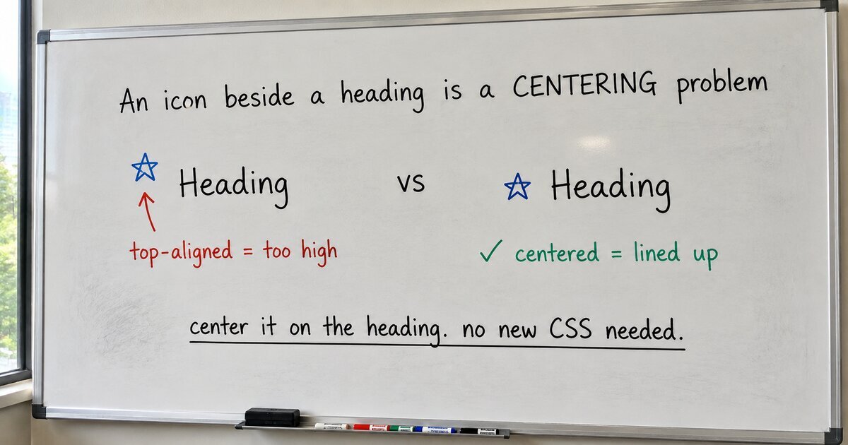
I put a small star to the left of a heading, top-aligned, the way every feature card on the web does it. It sat too high. Not by much, just enough to look wrong: the star hovered above the tops of the letters instead of standing next to them. I nudged it down a pixel. Then I changed the heading size, and the pixel was wrong again.
This is one of the oldest annoyances in CSS, and it is not your fault. The short version: CSS aligns boxes, and letters do not fill their boxes.
Here is the mechanism. A line of text is taller than the letters look. The browser wraps each line in a box built from the font’s metrics, then adds “leading,” extra space split evenly above and below the letters, to reach the line-height. Inside that padded box the glyphs sit wherever the font file decided: the cap height, the x-height, and the baseline are all offsets the typeface chose, and they differ from font to font. Vincent De Oliveira measured 1,117 installed fonts and found their default line-heights ranging from 0.6 to 3.4. There is no single number to correct for.
So when you tell flexbox to top-align the icon against the heading, it does exactly that, to the box. The icon’s top meets the top of the heading’s line box. But the letters start lower, below the invisible half-leading, so the icon ends up parked above them. vertical-align: middle does not rescue you either. MDN’s own definition aligns to “the baseline plus half the x-height,” and the x-height is the top of a lowercase x, which sits well below the middle of a capital letter. The CSS Working Group says it outright in issue #4707: middle “is a poor fit for glyph-sized elements like icons, which will always look a tad too low.”
That leaves the magic number, the margin-top: -2px we have all typed. It works until the font changes, or the weight, or the size, because the right offset is a function of the font’s metrics and not a constant. You are hand-computing something the browser already knows and will not tell you.
That lack held for a long time, and two things kept it annoying. CSS gave you line-height and nothing beneath it: no way to read the font’s metrics, trim the leading, or name the cap height. And reliable vertical centering was its own fight until flexbox landed in the mid-2010s, so for years even the right instinct was hard to reach for. So people did what you do: aim for the top of the box, or for the broken middle, and live with the few pixels.
The introduction finally happened. It is called text-box-trim, with its partner text-box-edge, and it does the one missing thing: it trims the leading off a text element down to a metric you name.
.heading {
  text-box-trim: trim-both;
  text-box-edge: cap alphabetic;
}
cap alphabetic trims the top flush with the cap height and the bottom flush with the baseline. Now the box hugs the letters, and anything you align to it lands on the letters instead of the leading: a heading pinned to a logo’s top edge, text sitting in a pill with even padding above and below. No per-font magic numbers.
Here is the catch, and the reason this is a 2026 story and not a 2021 one: it only just became usable everywhere. Chrome shipped it in February 2025, Safari a couple of months earlier, and Firefox on the 18th of August 2026, which is to say six days before I wrote this. MDN now marks it Baseline. A primitive people had wanted for years, and it is younger than most of my open browser tabs.
WordPress has not noticed yet. Core’s blocks align by box and stop there: Media & Text and Columns use align-self, Group and Row use align-items, and the request to add real vertical alignment (Gutenberg issue #16698) has been open since 2019. Search the Gutenberg repository for text-box-trim and you get nothing. The browser-level tool is stable, and core has not reached for it.
Here is what surprised me while I was building it. For the one thing everyone actually complains about, an icon beside a heading, you never needed any of this. The leading is split evenly above and below, so the middle of a line box already sits on the letters. Center the icon on the heading instead of pinning it to the top, and the two half-leadings cancel. It lands right with plain align-items: center, on a browser from ten years ago. I measured our worst-behaved icon at 0.9 pixels off the heading’s center with the trim applied, and 0.9 pixels off with it removed. Centering never had the leading problem, so the trim had nothing to fix.
So that is what our Icon Box does by default: it centers the icon on the heading, which asks nothing of the browser. There is a second reason centering wins, one layer down. Icons are drawn optically centered inside their own square, so the artwork does not sit flush with the box top. A shield, being bottom-pointed, gets nudged down to look centered in a button. Top-align it and you expose that offset; center it and you borrow the centering the icon maker already did. We keep text-box-trim for the case that genuinely wants it: aligning the icon to the top or bottom of a taller card, where the symmetry is gone and the leading is back.
The rule is smaller than the fuss around the new property. An icon beside a heading is a centering problem in a top-alignment costume: center it, and the leading takes care of itself, no text-box-trim needed. The property becomes the right tool the moment you align to an edge instead, which is why our Icon Box reaches for it there and nowhere else.
That block ships in our free Blockwright Blocks plugin, centered on the cap height out of the box. The most talked-about CSS of the year, and the alignment everyone wanted it for was a centering problem all along.